Sunday, September 29, 2013

Whoopee! Washi!

Since I'm still trying really hard to complete Stampotique Challenge Blog's challenges, here's a card for their Washi Tape Challenge!


I had a piece of leftover 140 lb. Strathmore Mixed Media cardstock, so I covered it with black and white chevron-patterned Washi tape, alternating the direction the chevrons were pointed. When that was done, I sponged on a few colors of Fresco Finish Paint by Paper Artsy but kept the paint layers thin so that you could still see the tape pattern. I *think* (as in dimly recall) I used Stone, Irish Cream, and Mermaid, then let this piece air dry because I was afraid my heat gun would melt the Washi tape.

When it was dry, I stamped Stampotique's Stack of Birds using black Archival ink, then colored the birds and ground using Distress markers, which are slowly growing on me. I added some clear Gelly Glaze pen to the birds' eyes, which didn't hurt  them a bit. Weathered Wood Distress ink was sponged around the Washi'd stamped panel.

Patterned papers from one of MME's Lost & Found pads were layered and thin chevron-patterned Washi tape was layered over the seams where the patterns met. Three strips of the larger chevron-patterned Washi tape, that was used on the stamped panel), were added going horizontally.

A sentiment from justjohanna/Odd Bird Planet was stamped onto patterned paper using Onyx Black VersaFine ink and die-cut. A small scrap of leftover Strathmore Mixed Media cardstock was sponged with the same colors of Fresco Finish Paint as above, then die-cut, and used to mat the sentiment.

The sentiment and image panel were adhered to the card and the entire card was edged with Weathered Wood Distress ink.

Thanks for visiting today!

I shall enter this card in the following challenges:
Stampotique Challenge Blog #118: Washi Tape
A Creative Romance: Fairytale or Winged Creatures
Simon Says Wednesday Challenges: Anything Goes
Crafty Bloggers Network: Things with Wings


Friday, September 27, 2013

SCACD New Release Blog Hop!

Today Susana Loves Stamps is releasing more wonderful MechAnimals, those fresh, unique, and edgy stamps that merge animals with steampunk imagery.

In addition to the new MechAnimals stamps, there are fabulous new Far East and floral-inspired rubber stamps being released today as well.

You can see all the new rubber HERE!

Plus, SCACD Digital is also releasing today a fun little gaggle of digital ghoulies that scream fun and sweetness.You can check them out HERE!

As always, our International friends can get these new releases at Quixotic Paperie.

You should have arrived here from Delphine's blog, where she definitely wowed and inspired you with a wonderful piece of art.

My first project features Peaceful Warrior, who is a Ming Dynasty/Steampunk horse from the new Eastern Dreams set.


Peaceful Warrior was stamped using Tuxedo Black Memento ink onto Neenah cardstock. He was colored with Copic markers that were chosen to look like jade and copper. When I was done coloring him, I fussy cut him, edged him with a black marker, and added Clear Glaze Gelly pen to his rivets. He was then set aside while I worked on the rest of the card.

The patterned paper is from the Steampunk Spells 6x6 pad by Graphic 45. Matching cardstock was die-cut with a variety of gears, then painted with Metallic Glaze paint by Paper Artsy. Layers were edged with Black Soot Distress ink. Steampunk themed Washi tape was added to a strip of cardstock so that Peaceful Warrior would be grounded!

The sentiment was stamped onto patterned paper using Onyx Black VersaFine ink.

Metal Chinese coins were colored with a Pentel Copper Metallic pen, sponged with Guacamole Fresco Finish paint by Paper Artsy, and then the paint was wiped off with a cloth. The coins were added to the gears as a finishing touch.

I have lots of plans for Peaceful Warrior I'm going to try to color him and coat him with Crackle Accents to make him look like an antique jade sculpture! Wish me luck and check back to see if I'm successful!

My second card features Sugar Floral Skull from the new collection called Skellies in the Closet.


Sugar Floral Skull was stamped onto Neenah cardstock using Tuxedo Black Memento ink ink. This stamp comes with a small butterfly stamp. I used a stamp positioner to stamp the butterfly into the eye sockets of the sugar skull.

Sugar Floral Skull was colored with Copic markers, then fussy cut and layered over script-text patterned paper from the Black & White Basics 6x6 pad by Basic Grey. SCACD's Classic Corners die was used to die-cut patterned paper from the Irresistible 6x6 pad by Authentique. The die-cut corners were used on all four corners of the image panel.

The balance of the patterned paper is from the  Irresistible 6x6 pad by Authentique. One of my favorite things to do with black and white patterned paper is to color it with Copic markers. That way I get patterned paper that perfectly matches my focal stamped image!

The sentiment, which is only available if you buy both new Sugar Skull sets, was stamped onto another sheet from the same pad and the little flower was colored to match the Sugar Floral Skull.

Thanks for visiting today! Your next stop on the hop is Dianne's (aka PackerDi of You Tube) blog. She's known for her You Tube Mixed Media videos.

Wednesday, September 25, 2013

Bombshell's Hump Day Hop!


 Alison, Bombshell's Challenge Captain, set this month's Hump Day Hop theme, which is Speed Demons: Masters of Transportation!
Greetings! If you want to sign up for the September Bombshell Hump Day Hop, you have come to the right place! This month, the theme is "Speed Demons: Masters of Transportation." Bombshell has lots of cool vehicles. Motorcycles, cars, even a beautiful ship! Make any of these items the focus of your project this month.
I'm the last stop at the hop! You should have arrived here from  Kelli's blog, where I'm sure she wowed you with something fabulous!

I'm an avid Sons of Anarchy fan, so I decided to use a motorcycle for the challenge. Fortunately Bombshell has several great motorcycle sets in the Hot Rod Collection. I opted to use the Let's Ride set, which has three different motorcycle silhouettes.

Here's my card!


I stamped the silhouette onto patterned paper from the Idea-ology Destinations Paper Stash pad using Onyx Black VersaFine ink. I love using this ink when I want a deep black with great coverage. This piece was die-cut using a Nestabilities Labels 18 die. The patterned paper was kept in the die and Black Soot Distress ink was sponged over it.

SCACD's Contempo Compass Statement Corner die to die-cut black/kraft Core'dinations Tim Holtz Kraft-Core Nostalgia cardstock (It's on sale!!!). The cardstock was removed from the die and lightly sanded. The corner was adhered onto the lower right hand corner of a piece of patterned paper from the Destinations Paper Stash pad, which had been edged with Black Soot Distress ink. The stamped diecut piece was adhered so that the it overlapped a portion of the die and two points of the star overlapped it.

A QuicKutz tag die was used to die-cut the black/kraft cardstock. The inner piece was reversed and Idea-ology Remnants Rubs were added to the kraft piece, while the black frame was lightly sanded.

A hole was poked into the top of the tag, three more holes were poked along the top of the card front, and two holes were poked into the patterned paper that was covered with the Contempo Compass Statement Corner die (I probably just lost you!). 1/16" eyelets were added along the top, to the tag, and to two of the holes in the die. Now I only have approximately 359,613 1/16" pewter eyelets left. The tragedy. By the way, I forgot how much fun it is to hammer eyelets.

Thin hemp cord was threaded through the eyelets along the top of the card and to the sentiment tag and that finished the card. Whooooo-eeeeee!

Thanks for visiting today!

Here's the hop list in case you got lost!
Bombshell Blog
Alison
Kim
Glittery Katie
Monika
Marnie
Leslie
Alaine
Susie
Kelli

I shall enter this card into the following challenges:
Cards for Men Challenge #19: String It Up
Craft Your Passion Challenge #181: No Colored In Images


Sunday, September 22, 2013

Birthday card!

I don't know about you, but I am always running out of suitable birthday and thank you cards. So I've been making these whenever I get a chance and stockpiling them waiting for a card to match a recipient. Not everyone appreciates every style, kwim?

Anyways, here it is!


I stamped Stampotique Originals' Girl with Heart Purse with Black Archival ink onto 140 lb. Mixed Media cardstock by Strathmore. I love that stuff. It's got a smoothish surface, but is heavyweight and tough enough to take a lot of abuse and abuse it I did!

Girl with Heart Purse was colored using my somewhat limited palette of Distress markers. I used the narrow side for the really skinny bits of her. I found that applying color with the brush tip onto my craft sheet and then using a barely damp water brush worked well for coloring her. I also used Craft Nibs with the Craft Nib holder to apply some of the colors as well whereI wanted to add a bit of shading in small places. If you don't have the Craft Nib holder and like the sharpish point of Craft Nibs, go get one. It's ergonomic and all that fun stuff. :D

A Distress marker was used to outline Girl with Heart Purse and to add a dotty background around her. I tore the edges, wet the cardstock, then sponged Tumbled Glass and Pumice Stone Distress inks onto the image panel.

The background was created with Tumbled Glass Distress Stain and sprays that I made with Fired Brick, Wild Honey, and Pumice Stone Distress Reinkers, water, and mini-misters. First Tumbled Glass Distress Stain was applied to the cardstock until I had the depth of color that I wanted. The colors were sprayed onto the craft sheet and the cardstock was dragged through the puddles. Water was misted onto the cardstock, and panel was heatset. Another layer of Tumbled Glass Distress Stain was applied and heat set. This process was repeated until I had a background that I liked.

I found an old Pebbles stencil that had birthday candles on it. I covered the flame parts of the candles with Post It notes and was left with the vertical candles. I changed their orientation to horizontal, then sponged Tumbled Glass Distress ink over the stencil on both sides of the panel.

I also had another old stencil that had little flower bouquets on it. The bouquets were traced using the fine tip of the Distress markers, then colored in with the brush tip.

Musical Washi tape was colored with a Copic marker, then used to ground the image panel. The same colored Washi tape was applied to a scrap of white cardstock and die cut with old QuicKutz arrows. Hearts were punched, sponged with Tumbled Glass Distress ink, and a birthday sentiment from Paper Trey's Mixed Messages set was added to one of them. I adhered everything and managed to leave an inky red fingerprint where I didn't want it, so I used the second heart to cover it. Tiny Attacher staples to the arrows and the heart.

I also have red fingerprints on my forehead, but they'll wash off. Besides, I didn't feel like stapling it to my head. I figured that might hurt.

Thanks for visiting today!

I shall be entering this card in the following challenges:
Stampotique Designers Challenge #117: Birthday Theme
Come & Get It Challenges: Birthday Theme
The Squirrel & The Fox Challenge #53: Happy Birthday


Saturday, September 21, 2013

Chick Magnet Ensemble for Stampotique's DT Call!

If you've been to my blog at all over the last six months, I've fallen head over heels in love with Stampotique Originals stamps. Their style, ranging from whimsical to edgy, makes me swoon in delight, especially since my style tends to run from whimsical to edgy to cute-ish with a bit of punny word play and humor thrown in for good measure.

When I saw that they were holding a Design Team Call, I knew I had to go for it as I adore working with these stamps. I had a gazillion ideas, but settled on this one.

It all started with Birdy Shoes. He's a very cute bird and he's sporting a pair of sneakers. The sneakers save him from becoming cutesie. In my world, cutesie is just not done. Anyway, I decided since he was so stylish, he needed some accessories and would attract some friends...

Hence...


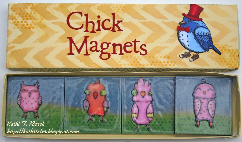
It was my first time making a box and it isn't the best piece of paper engineering I've seen, but it'll do. The box was made from 140 lb. Strathmore Mixed Media cardstock, which was painted with Fresco Finish paints by Paper Artsy. A darker shade was sponged over a stencil by Tando Creative, and some dots were sponged over the Tiny Circles stencil by The Crafter's Workshop.

Birdy Shoes was stamped with Onyx Black VersaFine ink onto the painted surface. He was stamped again with Tuxedo Black Memento ink onto Neenah cardstock and colored with Copic markers. Clear Gelly Glaze pen was added to his beak, then he was fussy cut and adhered over his stamped counterpart on the box's lid. A very old Snowman QuicKutz die was used to die-cut a hat and a bowtie, both of which were colored with Copic markers, then adhered to Birdy Shoes. QuicKutz alphabet dies were used to die-cut "Chick Magnets".


Four 2" Stampbord square tiles were temporarily adhered to scrap paper, so that they formed a continuous 8" surface. A mask was cut from scrap paper and used to form the separation between the grass and night sky. Distress inks were sponged over the mask until I was happy with the result. Then Copic Opaque White was flicked over the sky to simulate stars.

Birdy Up is a fabulous stamp because it has four fabulous birds that can be used together or separately or in combination. Birdy Up was stamped with Tuxedo Black Memento ink onto Neenah cardstock, colored with Copic markers, fussy cut, and each was adhered to a tile. Dazzle Frost Shimmer VersaMark was applied to each tile and embossed with Filigree Clear embossing powder. This process was repeated several times to produce a thick glossy layer on each tile. I didn't realize how much the colors would change after all the layers of embossing were added, but they did start out quite different from each other. Nonetheless, I like 'em. Oh. Yes. The last step was to add magnets to the back of each tile.


The next part of the ensemble to create was the card. Birdy Shoes was stamped with  Tuxedo Black Memento ink onto Neenah cardstock and colored with Copic markers. Clear Gelly Glaze pen was added to his beak. He was masked with a previously created mask, then a floor was drawn in. A Disco Ball by Memory Box was stamped towards the top and onto Eclipse tape, which was fussy cut, and adhered over the image on the card. My Copic Airbrush system was used to airbrush a background over both Birdy Shoes and the disco ball. The masks were removed and the disco ball was colored with Copic markers and coated with a layer of Clear Wink of Stella Glitter pen. The glitter pen was also used with the Sunburst stencil by The Crafter's Workshop to create a glittery aura from the disco ball.

The patterned paper is from the Cupcake 6x6 pad by Basic Grey. The sentiments are from justjohanna/Odd Bird Planet.

And here's one final image of the ensemble all together!


Thanks for visiting today!

P.S. I would be happy working for either the Challenge Design Team or their other one! I just would love the chance to work with this fabulous company and great group of designers!!!

P.S.#2: You can see my other Stampotique creations by clicking on Stampotique in the Label puzzle thing over there on the right. 

P.S.#3: Not to SSP (shamelessly self promote), but there's a separate page link to the right that shares my crafting resumé, including publications, past/present design team experience,etc.


Tuesday, September 17, 2013

Rosie the Riveter Bombshell Style!!!

Bombshell Stamps has just released a new digital stamp set, featuring Rosie the Riveter! She fits in perfectly with all the other Bombshell Stamps because she has attitude to spare!

I think that this set will be perfect for encouragement cars and will be especially effective done up in pink for Breast Cancer Awareness month!

 I sized her down slightly and printed her out onto Neenah cardstock using my laser printer. She was colored with Copic markers. Chalk pencils were  used to add additional shading to her face and a slight blush to her face. Clear Gelly Glaze pen was used to accent her fingernails and her lips! She was fussy cut and placed inside a matted Nestabilities oval.

The colors of her outfit were chosen to match the patterned papers which are from 6x6 pads by Farmhouse Designs, Authentique, and Prima. Both pads appear to be sold out at the moment, but there are some gorgeous new pads available HERE!

Ideology screwhead brads and a Prima screwhead thingy were used to accent the piece.

You really ought to go check out the Bombshell Blog! The Bombshell Girls did an awesome job showcasing this new set!

Thanks for visiting today!

Sunday, September 15, 2013

FLY tag

It's now 4:00 a.m.-ish, which is what happens when you don't eat all day, then drink two cups of coffee at 7:00 p.m., and then have some wine.

This is also what happens.


My tag is inspired by Alison Bomber's Tutorial post #two at Paper Artsy's blog.

Like hers, mine uses Fresco Finish painted torn corrugated cardboard, text/music paper, Distress inks, and stamping.

However, I cheated. I used printed papers from My Mind's Eye Lost and Found 6x6 pads rather than true text paper. I die-cut corrugated cardboard, which made it easier to peel off a layer. I also used Stampotique's Moon Girl to fulfill another challenge (and one to myself). Wink of Stella Clear glitter pen was used on the fairy's wings because when there are fairies, there is always fairy dust, aka glitter.

I'm a hoarder and keep all sorts of things that I think will be useful one day in my crafting. I have a lots of corrugated cardboard, which I have meant to use, but haven't gotten around to doing. Until this evening.

As stated above, I started by die cutting corrugated cardboard, tore off the top layer, then painted it with Nougat Fresco Finish paint. 

I chose music-themed patterned paper and painted it with watered down Fresco Finish paints (Sky, Lilac, Toad Hall, Hey Pesto, and Limelight) and and heat set it. When it was dry, I stamped the birds with grass from Paper Artsy's Hot Pick #1005 set using Onyx Black VersaFine ink and heat set it.

I used a piece of Cut N' Dry foam to apply Moonlight Fresco Finish paint to Moon Girl (seems appropriate), then stamped her onto text-patterned paper. Lilac and Concord Grape Distress inks were used to color her, then Wink of Stella clear glitter pen was added to her wings and edges, pink glitter pen was added to the heart on her dress, and clear Glaze pen was added to her eyes, which didn't hurt her one little bit.

Studio Calico Darling Dear Wood Vaneer letters were painted with Eggplant Fresco Finish paint and heat embossed with Filigree Clear Detail embossing powder.

Concord Grape Distress ink was sponged on the painted corrugated cardboard tag. The stamped painted scene was torn, edged with Concord Grape Distress ink, and adhered to the tag. The sentiment was adhered with glue and Moon Girl was adhered with dimensional foam adhesive.

Experimenting with new techniques and media has been big fun!

Thanks for visiting today!

I shall enter this tag in the following challenges.
Paper Artsy Blog: Challenged By Alison Bomber
Stampotique Designers Challenge #116: Try a new technique
Simon Says Wednesday Challenges: Emboss It!
Simon Says Monday Challenges: Embossed


Friday, September 13, 2013

Altered Clipboard

As you might know, I've become infatuated with all things Paper Artsy. I joined their #3Up PATWITS challenge and now I've altered a small clipboard using techniques that I gleaned from Alison Bomber's Paper Artsy Blog posts during her first week on Paper Artsy's Design Team.

I didn't make a project composed of three parts, I just decorated my little clipboard. However, I did use some of the techniques that she used in her projects. 
• Stamped and embossed with clear embossing powder.
• Applied Grunge Paste through a stencil.
• Painted and embossed with clear embossing powder.
• Brushed diluted Fresco Finish paint over a stamped image.
• Stamped my images onto tissue paper, cut 'em out, and moved 'em around to get an idea of what I wanted where. 


My first step was to paint the clipboard with gesso, which I had actually done a few months back. Then I set the clipboard aside, put it somewhere safe (aka the black hole of my craft room), and worked on other stuff. I decided to use the clipboard for this challenge and had to find it. Oh no!

When I finally found it, I painted it with a variety of Fresco Finish paints and heat set them.

I painted the metal portions of the clipboard with Fresco Finish paints, heat set it, squished my Frost Dazzle VersaMark inkpad onto the front of the clip, dumped clear detail embossing powder onto it, dumped off the excess, and heat set it. I did that twice.

A sun charm was painted with Fresco Finish paint and heat embossed with clear embossing powder. The dragonfly charm was plastic, so I didn't want to risk heat embossing it, so it was painted with Fresco Finish paint, then pressed onto an inked stamp. The charms were set aside.

I tinted some Grunge Paste with Hyde Park Fresco paint and used a palette knife to apply it through a vine on a very old Pebbles stencil. I immediately cleaned the stencil and the palette knife and had dinner to give the Grunge Paste time to dry, though the first side seemed to be dry as I was finishing the second vine.

I stamped the birds with grass from Paper Artsy's Hot Pick #1005 set using Onyx Black VersaFine ink and heat set it. Sadly, the impression is not perfect because the paint/gesso was slightly uneven.

The quote, from Paper Artsy's Ink and the Dog Mini #48, was stamped and heat set with clear embossing powder.

Fresco Finish paint was sponged over a stencil from Tando and heat set. The two moths, from Paper Artsy's Stamp and Die Set #01, were stamped with Onyx Black VersaFine ink. Stamping them took a bit of juggling as I had to keep the clip open to maneuver the stamp and block under the open clip to stamp the images where I wanted them. After some fiddling, I used a bottle of glue to prop the clip open while I stamped. Ingenuity is the mother. I'm a mother. Yeah.

The Fresco Finish paint colors I wanted to use are opaque, so they were misted with water to dilute them, then painted over the moths. The piece still needed something, so I stamped the two-pence stamp, from Paper Artsy's Hot Pick #1005 set, into the upper left hand corner.

The vine was touched up with a fine paint brush and Hyde Park Fresco Finish paint. The charms were added to the clip board, and it was done! Best of all, the clipboard is both decorative and useful! Gotta love that!

I shall enter this project in the following challenges:
Paper Artsy Blog: Challenged By Alison Bomber
Simon Says Wednesday Challenges: Emboss It!
Simon Says Monday Challenges: Embossed

Thursday, September 12, 2013

Happy Fall Fun!

We had a lovely stretch of cooler weather over the weekend, but it's been hot, Hot, HOT! the last few days and very, very humid too! Mother Nature is a tease. However, I know that fall is coming because we're beginning to get some apples with our CSA farm share! I hope we only get one pumpkin though because I detest pumpkins as a food group. IMHO they're only good for two things, taking children to pick a pumpkin and carving it into a Jack O'Lantern. I guess I could always put an extras out for our grey squirrels to eat! (We don't get red squirrels here, though we've had an occasional black one!).


Kraftin' Kimmie's  Pick of the Patch was stamped using Tuxedo Black Memento ink onto Neenah cardstock and colored with Copic markers, which I'll list below. The colors were chosen to match the patterned papers from my hoarded Mellow 6x6 pad by Basic Grey.

The sentiment was created using equally hoarded Doodlebug Rub-Ons, which I love because they're small and in a fun font. Sadly, they're almost gone. Boo-hoo. The leaves were punched from the more solid papers from the pad, then tinted with Copic markers.

I based my card on this great sketch from the folks at Sketch N Stash.


Thanks for visiting today!

Copic Markers used:
Skin: YR000, YR00, R000, BV000, R21
Hair: E44, E47, E49
Outfit: YG03, YG05, YG07, YG17 Y11, Y13, B21, B23
Pumpkins: YR00, YR02, YR12, YR16, YR18, YR27, YR61, YR65
Squirrel: C00, C0, C01, C02, C04
Wagon: E04, E07, E19, N04, N06
Ground: E40, E41, E42, Ed43, C01, C03
Sky: B0000, B000

I shall be entering this card in the following challenges:
Kraftin' Kimmie Challenges #195: Fall Fun
Sketch N Stash Challenges #121
Basic Grey Challenges #102: Anything Goes
Craft-Room Challenges: Trees and Leaves

Tuesday, September 10, 2013

Stampotique Designers Challenge #115: Lots of Layers

Since I fell in love with Stampotique stamps earlier this year, I've challenged myself to participate in as many of the challenges on their Designers Challenge blog.

Here's a card for Challenge #115: Lots of Layers.


Stampotique's Birdy Shoes wanted to make some new friends, so I found him some papers from My Mind's Eye's Fine and Dandy: Girl & Boy 6x6 pads that featured birds. I decided that paper-piecing Birdy Shoes and layering papers would be a great way to meet the challenge.

I stamped Birdy Shoes four times. Once onto the graph/bird patterned paper and then onto three different sheets of patterned paper. I fussy cut the head, torso, and wings, added shading with Copic markers, then edged each piece with a black Big Brush marker. When I was done, I adhered each part to its respective body part on the base image. Clear Glaze gel pen was added to his beak and Clear Wink of Stella glitter pen was added to his sneakers.

I decided that Birdy Shoes needed to be grounded, not because he was a bad birdy, but because I didn't want him floating in air. So I added some light YG Copic under his feet and under the feet of the other birds. Can't have ungrounded birds unless they're in flight. That just wouldn't do.

I set about layering four different patterned paper for the card front. That wasn't enough layering for me though, so I die-cut more patterned papers using a banner die from Taylored Expressions. I fussy cut a flag from each sheet and layered them onto a base banner. The banner was edged using the black marker. I punched two tiny flowers and layered them atop glittery black metallic vellum circle punchies, which were used to anchor the banner. Black rhinestones were added between each banner and tiny black rhinestones were used as the center of the anchor flowers.

I still thought I needed some more layers, so I die-cut green patterned paper (hadn't used green paper yet) using a Fishtail Flag die by Die-namics. That needed to be layered too, so I die-cut a size larger from glittery black metallic vellum.

I had thought I'd use a speech bubble die for the sentiment, but decided to use the horizontal fishtail banner instead. The sentiment, from the sadly defunct justjohanna/Odd Bird Planet Stamps, was stamped using Onyx Black VersaFine ink because I think it does the best job with finely detailed or small stamps.

Thanks for visiting today!

I shall enter this card into the following challenges:
Stampotique Designer's Challenge #115: Lots of Layers
C is for Challenges #5: Lots of Layers
The Crafty Bloggers Network: Things with Wings
Lady Anne's Challenge: Must Have Wings
Paper Playtime: Must Use Three Different Papers


Monday, September 9, 2013

Bombshell Stamps Muse Monday!

It's Muse Monday over on Bombshell's Blog! This month we're featuring the Rise & Shine Tattoo Rubber Stamp sett, which will be on sale throughout September! I love the cool retro vibe of this stamp set.

Here's the set!

Here's what I've done with the set!


I stamped the girl in the hammock onto Neenah cardstock and colored her with Copic markers, which I'll list  below.

Using the Copic T series markers, I drew in the beams supporting her hammock as well as the cabin paneling that is behind her. When I was done, I added Clear Gelly Glaze pen to add dimension and shine to the glass in the porthole. 

I stamped the sentiment banner a second time, colored it with Copic markers, fussy-cut it, and popped the center up on dimensional adhesive with the edges glued down over the corresponding image on the scene.

The patterned papers are from the Down by the Shore 6x6 pad by Fancy Pants. It seems to be out of stock, but you can find some great 6x6 pads HERE!

Thanks for visiting today!

Copic markers used:
Skin: E000, E00, E11, E93
Hair: B26, B41, C4, C5, C6, C7
Suit: R24 R27, R37
Sunset: BG72, R32, Y11, Y13, B21
Paneling and Beams: T0, T1, T2
Sentiment Banner: R000, R00, R01, E41 

By the way, there's a Guest Design Team Call going on over at Bombshell Stamps. Here's a link to the information that you need for your application! The deadline for applications is midnight, PDT on September 14th! 

I shall enter the following challenges:

Saturday, September 7, 2013

Makin' a scene with SCACD's Fairy Queen!


The one thing that I really love about digital stamps is that you can resize them and flip 'em. Oops. That's two things. You can also easily create scenes with them, which I guess is a third thing.

Anyway, that's exactly what I've done here. Using PhotoElements, I've resized SCACD's Fairy Queen, Gryphon, and Teeny Tiny Blue Jay digital stamps and placed them into a scene. I also flipped one of the two Blue Jays!

I printed out the scene onto Neenah cardstock using a laser printer, then colored it using Copic markers which I'll list below. When the images were colored, I drew in the stone wall using Copic markers. Some clouds were die-cut from Eclipse paper, placed onto the scene, traced with a C00 Copic marker. This process was repeated until I had a nice cloudy sky. The blue sky was filled in and the clouds were shaded, also using my Copics.

The sentiment was created by using two words from Ideology Chit Chat Word stickers. Lines were drawn in using a Copic Multi-liner.

The patterned paper is from the Natural 6x6 pad by Authentique and was edged with a Gold Spica Glitter pen. The card was finished with two filigree gold metallic corners cut with a SCACD Classic Corners Die and a gold metallic chain cut with Memory Box Delicate Chain die.

Copic Markers used:
Skin: YR0000, YR000, YR00, R000, R20, BV00
Hair: C4, C5, C6
Dress: BG23, BG32, BG34, BG45, BG49
Wings: BG000, BG00, BG11, BG23, BG90, BG93
Gryphon: Y21, Y23, Y26
Blue Jay: B02, B04
Wall: T0, T1, T2, T3, T4
Ground:E43
Sky: Custom less than B21
Clouds: C00, C0, C1

I shall enter this card in the following challenges:
Southern Girls Challenges: Make Believe
Flutter By Wednesdays Challenges #251: Anything Goes
Creative Card Crew Challenges: Things with Wings
Simon Says: Wednesday Challenge Blog: Animal Antics


Thursday, September 5, 2013

Paper Artsy #3Up!

During the last several months, I've become enamored of stamps and paints by Paper Artsy. In my quest to learn more about these great products, I've become quite the stalker of Paper Artsy's blog, You Tube channel, and Facebook page. So when I saw something about a challenge for fans that was being sponsored over at Twitter,  I asked to be included and was delighted to find out that I could play along!

The challenge is that we would be sent three things and we'd have to create a project using them. I love challenges like this because they're the ones that make me think and force me to grow outside my usual comfort zone!

Well, since Paper Artsy just celebrated their tenth birthday, Leandra, Queen Paper Artsy, was feeling festive and sent quite a bit more than three products! I received a color swatch, a stamp set from the Lynne Perella Collection, specifically LPC004, a large triangular Masonite pennant, Teresa Collins Everyday Moments Buttons, a few pieces of Smoothy Stamping Card,  a cute container filled with three tiny tags, eyelets, brads, and safety pins, and a sheet of instructions. I was especially thrilled by the stamp set as I had been ogling all the sets in the Lynne Perella Collection, but couldn't decide which to get first! Now that impasse has been broken and I can start collecting. :D 

Here's the wall hanging that I created with the goodies in my package!


All stamping was done using Onyx Black VersaFine ink, which was heat set. A stamp positioner was used to line up the vertical row of ladies. Most of the images were colored with Copic markers with a bit of chalk-penciled blush and shading. Clear Gelly Roll Glaze pen was added in spots, and then the pieces were edged with Black Soot Distress ink. The hats were stamped onto mostly solid patterned papers (including one from the swatch sheet!), fussy cut, and added to the trio of vertically stacked ladies.

I wanted to use as many stamps from the set as I could, so I needed a larger surface for the pennant. I searched my stash and came up with an acrylic page from a mini book kit to be used as the base. This acrylic page was sanded then painted with Vanilla, Tinned Peas, Mermaid, Pumpkin Soup, Hey Pesto, Beach Hut, and South Pacific Fresco Finish Paint. I discovered that the paint took longer to dry completely on acrylic, so it was set aside while the Masonite pennant was painted with the same combination of colors.  When I was finished with the pennant, the acrylic piece was fully dry and ready for some stenciled accents. South Pacific Fresco Paint was used to stencil three rows of heart arrows from the Arrows and Hearts stencil by The Crafter's Workshop and some text from the Art Is stencil, also by The Crafter's Workshop.
***
Digression: I must note that these paints are amazing. They go on smoothly, blend wonderfully, and dry quickly to a chalk-like finish that accepts stamping really well. I also should note that I am still low on the learning curve of using them well, but at least I'm enjoying the process!
***
End of digression: There was a 1.25” gap between the Masonite pennant and the top of the acrylic page, so I cut three pieces of chipboard and adhered them together to fill that space and to be the same height as the Masonite. An embossing folder was used to emboss metal Flashing Tape, which was then adhered to the chipboard brick. I used a stylus to add stripes, dots, and crosshatches to the tape, brushed South Pacific Fresco Paint over the embossed ta detailed tape, let the paint set for a minute, then wiped it off with a paper towel leaving paint in the indentations. 

A flat wooden button from my packet was painted with Vanilla and Pumpkin Soup Fresco Paint and a Masonite heart was painted with Beach Hut and South Pacific Fresco paint. The heart was used to cover up the buttonholes. When the paint was dry, I added Glaze Pen over it to make it shiny.

The tags from the packet were painted using Vanilla, Pumpkin Soup, and South Pacific Fresco paint. Alphabet Rub-ons were added to them. I watered down some Vanilla Fresco paint and brushed it across the stamped colored shell pieces.

I first tied silver metallic ribbon through the holes on the acrylic page. Then the metallic block was adhered over it and the rest of the piece was assembled.

Here's a closer view of the top part of the piece.


Whereas this packet was initially daunting, I had a fabulous time creating it. I'm so very pleased to have been included in Paper Artsy's celebration and wish them years and years of growth and success!

All the projects from #3UP particpants are being featured on Paper Artsy's blog this week, so you should check them out! Just grab a cuppa or a cocktail, get comfortable, and clear some time to do so. There's been some amazing work! Oh! My project is up over there with a shorter version of the above. The instruction sheet asked us to be brief and concise in the verbiage for their blog post. That probably was the most difficult part of the challenge for me as I tend to be a teensy-bit verbose.

Thanks for visiting today!
  

Tuesday, September 3, 2013

Circles, circles everywhere!

The Stampotique Designers issued a "Three Circles" challenge that made me look at the world differently. Circles! They're everywhere! Snowglobes, clocks, knobs -- oh my!

Here's my take on the challenge:


I did an old-as-the-sun, but new-to-me, technique. For some reason, I never did this before, but I didn't want Moon Girl's little dress to be solid black... So, I colored on the Moon Girl rubber stamp with Distress markers, huffed on it, and stamped the image onto the circle of a Memory Box. It was masked and the process was repeated until I had three little Moon Girls in a snowglobe. I wasn't satisfied with the coverage, so I colored over the Distress marker with Copic markers and added Wink of Stella glitter pen to each pair of wings. Then the "globe" was colored to match the "wall" behind it. Copic Opaque white was added for glare, then clear glossy paint was added over that.

The snowglobe, containing the Moon Girls, needed to sit on something, so I built a cabinet, which I topped with a lacy patterned doily, die-cut from patterned paper. If Moon Girls can live in snowglobes, then doilies can be patterned. Yep.

I needed some more circles, so I die-cut a clock from gold and black cardstock using SCACD's Classic Timepiece die. Then since the snowglobe is transparent, I had to add more color it, which was more or less successful. Planning in advance would have been a good idea. Oh well.  Meanwhile, I still needed circles, so I die-cut two circles and added gold pearls to them for cabinet knobs. Colored rhinestones finished the piece. Tahdah.

Thanks for visiting today!

I shall enter this card in this challenge:
Stampotique Designers Challenge: Three Circles
Simon Says Stamp Wednesday Challenges: Anything Goes