Tuesday, March 31, 2015

Be Yourself!


Meet Be Yourself, one of the stamps from SCACD's Brave Hearts Collection of rubber stamps! Guess what?!? All four of these great girls and their accompanying sentiments from the Brave Hearts Collection are now available from SCACD as digital stamps, so you can resize 'em, flip 'em, and group 'em with your computer!

Be Yourself  was stamped with Tuxedo Black Memento ink, colored with Copic markers,  fussy-cut, then edged with black marker. I used a bit of chalk pencil to add blush to her cheeks and to add a bit of shading to her skin. She was then set aside while I created a card background for her.

The patterned papers are from Classique Elegant and Latest and Greatest 6x6 pads (Authentique). They were layered acccording to Sketch #194 from Deconstructing Jen. The fishtails are from the Fishtail Stax (Die-namics). A bottlecap die was used to die-cut black cardstock. A CM circle punch was used to punch the patterned paper circle and a heart punch was used to punch spider-web patterned paper, which was then colored with a Copic marker. Black Soot Distress ink was used to edge most of the paper layers.

Here's the sketch so you can see how I did!


Thanks for visiting today!

I shall enter this card in the following challenges.
Deconstructed Sketch Challenges: #194
Addicted to CAS Challenges: Cute

Sunday, March 29, 2015

Dragon Fire


Meet SCACD's Creative Sparksfrom the who is from SCACD's September 2013 rubber stamp release. Creative Sparks is a Chinese fire-breathing dragon and a very handsome fellow.

Creative Sparks was stamped with Tuxedo Black Memento ink and colored with Copic markers in traditional Chinese dragon colors. His eyes, teeth, and talons were several layers of Clear Gelly Glaze pen (Sakura) to add dimension and shine. The dots were touched with Orange Spica glitter pen (Copic).

The stamped panel and its edges were sponged with Black Soot Distress ink to add a sooty look. It was then matted onto black cardstock, then onto green silk-finished specialty paper (FiberMark). The patterned papers are from the Bird Song 8x8 pad (Graphic 45) and were edged with Black Soot Distress ink before being matted with black cardstcok.

The green silk-finished specialty paper was die-cut with the coin from the Oriental Embellishments die set (Tattered Lace), mounted onto punched circles, and then die-cut Pinked Circles (Spellbinders).

Thanks for visiting today!

I shall enter this card into the following challenges:
613 Avenue Create Challenges: Anything Goes
Southern Girls Challenges: Punching Above Your Weight
Papertake Weekly Challenges: A Cut Above

Friday, March 27, 2015

Thanks and Anything Goes

This week's challenge at The Outlawz Coloring Challenges is "Anything Goes" with an optional Christmas/Holiday twist. My Outlawz Coloring Challenge Teammates, Carla, Penny, Laine, and I challenge you to use create a project for this challenge. You can use any color medium you like, just as long as you color! 

Our March sponsor at The Outlawz Coloring Challenges is Sweet Pea Stamps, who is offering our lucky winner four digis of his/her choice from the Sweet Pea Digi Stamp Store.  Play along with us for your chance to win!


The Protector was resized in Photo Elements and printed out onto Neenah cardstock using my laser printer. After checking Google Images to learn about foxes, the wonderful scene was colored with Copic markers. The Protector's cheeks received a wee bit of blush courtesy of a pink chalk pencil. A beige chalk pencil was also used to add a little shading to the sides of her face, her nose, and her neck.

The image panel was die-cut using one of the dies from Straight Rectangle Multi-Frames die set (Nellie Snellen).

The design of the card was inspired by a sketch from Try Stamping on a Tuesday, though I had to alter it a bit to make it work with the The Protector. The patterned papers are from the French Country 6x6 pad (Graphic 45). The fishtails are from the Fishtail Stax (Die-namics). Most of the layers were edged with Black Soot Distress ink. The "Thanks" die (Elizabeth Craft Designs) was used as my sentiment, especially since one can always use thank you cards!

Here's the sketch so you can see how I did.


Thank you for visiting today.

I shall enter this card into the following challenges:
The Corrosive Challenge Blog: Animal Friends
Try Stamping On a Tuesday Challenges: Sketch 
Moving Along with the Times Challenges: Into the Wild
Simon Says Stamp Wednesday Challenges: Anything Goes

Wednesday, March 25, 2015

Favorite Background Techniques

Nellie van Leeuwen is our hostess this week at Stampotique Designers Challenge Blog. Her challenge is "Your Favorite Background Technique".

This is what she had to say about her challenge.
"What's your favourite technique to make backgrounds? I love making backgrounds with on a craftsheet. Quick and easy and yet a different result all the time.."
 If you'd like the chance to win your choice of $30 worth of Stampotique stamps, you should play along with this challenge. Visit Stampotique Designers Challenge blog and be sure to read the rules so that you'll have the chance to win that great prize!!!  

Here's my card with Stampotique's 3 Dwarfy Gnomes and 4 Dwarfy Gnomes (Kira Nichols).


Nellie's challenge made me think a bit, which is always a relatively scary thing. I realized that I have several favorite ways to create a background for my projects. I then realized that all of them have three elements in common, namely paint, stencils, and ink. So I went ahead and did just that.

I must confess that my project took a left turn somewhere (Albuquerque) and came out completely different than I originally had planned. But sometimes the journey is half the fun!

3 Dwarfy Gnomes and 4 Dwarfy Gnomes were stamped with Tuxedo Black Memento ink, colored with Copic markers, and fussy-cut. When I was done cutting, I coated all their shoes, their eyes, buttons, and belt buckles with several layers of Clear Gelly Glaze pen. Pink chalk pencil was used to add blush to their cheeks. 3 Dwarfy Gnomes and 4 Dwarfy Gnomes were set aside while I created a forest background for them.

Music patterned paper was adhered to 180 lb. Mixed Media cardstock (Strathmore) using Media Matte Medium (DecoArt) and left to dry. Translucent White Media Fluid Acrylic paint (DecoArt) was mixed with a drop of Pthalo Blue MFA paint and painted over the music-covered cardstock to create a blue sky.

Potting Soil Archival ink (Ranger) was sponged through the Branches Reversed stencil (The Crafter's Workshop). Leaf Green and Emerald Green Archival ink (Ranger) was sponged over the Tiny Circles stencil (The Crafter's Workshop) to add a green leafy look to the tree branches. Sepia and Black Pitt Artist's pens (Faber-Castell) were used to add fill in, add dimension, and shading to the tree branches.

The painted, inked, stenciled cardstock took a ride through my Big Kick inside one of the dies from the 5x7 Card Creator die set (Spellbinders). Jet Black Archival ink (Ranger) was used to edge the die-cut panel.

The sentiment was created with my Dymo labeler and adhered to the base of the card front.  3 Dwarfy Gnomes and 4 Dwarfy Gnomes were adhered to card front and added to a 5x7 card. Black Photo Corners (3L Adhesive) were added to all four corners to finish the card. I now realize that you can't see the music paper very well at all due to the positioning of the 7 Dwarfy Gnomes. If you squint, perhaps you can!

Thanks for visiting today!

I shall enter this card into the following challenges:
Loves Rubberstamps Challenges: Create Your Own Background

Papertake Weekly Challenges: A Cut Above
Through The Purple Haze Challenges: Anything Goes
Simon Says Stamp Wednesday Challenges: Work It Wednesday

Friday, March 20, 2015

Color Challenge

This week's challenge at The Outlawz Coloring Challenges is a color palette/photo challenge. My Outlawz Coloring Challenge Teammates, Carla, Penny, Laine, and I challenge you to use create a project for this challenge. You can use any color medium you like, just as long as you color! 

Our March sponsor at The Outlawz Coloring Challenges is Sweet Pea Stamps, who is offering our lucky winner four digis of his/her choice from the Sweet Pea Digi Stamp Store.  Play along with us for your chance to win!  


 Here's the color palette courtesy of Design Seeds.

If you know me, you know that I'm mad about cats. In fact, I want to grow up and be A Crazy Cat Lady. I've been told that I've already achieved half of that goal.

Therefore, it should come as no surprise that I chose to work with The Kitty Collector this week. Isn't she lovely and aren't all those little grey cats adorable? Can't you hear the purring by the one she is petting? I know I can.

The Kitty Collector was resized in Photo Elements and printed out onto Neenah cardstock using my laser printer. The wonderful scene was colored with Copic markers, chosen to match the color palette, though looking at the palette now, I'm a bit off and have veered more plum than violet. Too bad, so sad. Or it could be the photo that I took inside at night by the light of my Ott light.

Oops. I digressed. I used chalk pencils to add blush to her cheeks. The green baubles in and around her hair were highlighted with several layers of Clear Gelly Glaze pen to add dimension and shine.

The image panel was die-cut using a die from one of the Blueprints set by Die-namics. The patterned papers are from an old 6x6 pad by My Mind's Eye to match the Copic colors I had chosen. Most edges were distressed.

The Pastry Labels die (Memory Box), Missy Micro font die (Die-Versions), and corner dies (eek! I can't remember who made them) were used to die-cut patterned paper so that everything would be all matchy-matchy. Oh look! The second "r" in Purrfect is off. Bad me. Perfection is overrated or so they say.

Lace and pearls were added to reinforce the vintage vibe of the Kitty Collector  and finish the card.

Thanks for visiting today!

I shall enter this card in the following challenges:
Crafty Cardmakers and more Challenges: For that Special Woman (Crazy Cat Ladies)
Simon Says Stamp Monday Challenges: Lions and Lambs, oh my!
Through the Purple Haze Challenges: For Your Mum or Other Woman in my life 
The Corrosive Challenge Blog: Animal Friends

Thursday, March 19, 2015

Be the Change!

Here's a Steampunk scene that is inspired by Spring. Now if we'd only get the appropriate weather! I am so very ready to enjoy some warm weather and the sight of flowering trees, birds in their spring plumage, and beautiful butterflies.


This card features SCACD's new Butterfly Chrysalis rubber stamp, which is part of SCACD's Eclectic Collection #2.

As usual, I googled "Chrysalis" and was delighted to discover that they can be golden, which works with the quasi-Steampunk feel of this image. I then googled "Emerging Butterfly" and found a butterfly image with the coloration you see above. I do like having a tiny bit of reality intrude into my fantasy scenes. It's the Virgo in me. :D

Butterfly Chrysalis was stamped with Tuxedo Black Memento ink, colored with Copic markers, fussy-cut, then edged with black marker. Butterfly Chrysalis was set aside while I worked on the rest of the card.

Blue cardstock took a ride through my Big Kick (Sizzix) on top of the Clocks Embossing Plate (Cherry Lynn Designs). Gold Bling metallic specialty paper (FiberMark) from my stash was die-cut with SCACD's Breezy Branches Statement Corner and SCACD's Alice's Clock Statement Corner dies. Rose Gold, Gold, and Green Bling metallic specialty paper was die-cut with Mini-Gears, Deluxe Gear set, and the Antique Gear set (Memory Box). The gears were layered atop the corner dies and KaiserCraft Pearls were added to the center of most of the gears. Green metallic specialty paper was die-cut with the A Hint of Lime font dies by Die-Versions for the sentiment.

Thanks for visiting today!

I shall enter this card into the following challenges.
SanDee and Amelie's Steampunk Challenges: Gear It Up
Just Inspirational Challenges: Flourish and Bling
Die Cuttin' Divas Challenges: Spring
Scrapy Land Challenges: Dies plus Spring/Easter

Wednesday, March 18, 2015

Neon!

Astrid Stulemeijer is our hostess this week at Stampotique Designers Challenge Blog. Her challenge is "Neon".

This is what she had to say about her challenge.
"At first I was a bit afraid of these intense colors, but after using them I really love them. They give your work such a nice 'pop'. I challenge you to use at least one Neon color. Can't wait to see your eye popping work :-)"
If you'd like the chance to win your choice of $30 worth of Stampotique stamps, you should play along with this challenge. Visit Stampotique Designers Challenge blog and be sure to read the rules so that you'll have the chance to win that great prize!!!  

I must say that this Neon challenge was a real challenging one for me (which I guess is the point of a challenge after all) because as much as I like bright colors, I don't really like neon and day-glo colors. As such, I don't have a lot of media in these colors. The closest that I do have are Dylusions sprays and a few Distress colors (Picked Raspberry and Ripe Persimmon). I'm also not a big spray gal as I can't control their application very well. As a control-freak Virgo, I find that distressing and not in the fabulous aged grungy way. But, I decided to just go for it and this is what happened.

Here's my journal spread which uses Chessy, Rabbit, and The Tweedles. All three stamps are Janet Klein's designs!


Chessy, Rabbit, and The Tweedles were stamped with Tuxedo Black Memento ink, colored with Copic markers in seriously-bright-verging-on-neon colors, fussy cut, and edged with a black marker. Several layers of Clear Gelly Glaze pen were added to Chessy's eyes and teeth,  Rabbit's  pocket watch, and The Tweedles' cufflinks and shoes to make them dimensional and shiny. White Gelly Glaze pen was added to The Tweedles' trousers. Rabbit's and The Tweedles' eyes were coated with Liquid Glass (DecoArt's Media line) to add glassy pop-eyed dimension and shine. All my characters were put aside overnight while I worked on the background for the journal pages.

As previously stated, I don't much like spray paint because it gets everywhere and because I can't seem to control my spraying. I grabbed a pizza box and opened it on my table to protect the table and stuff that lives there. Two sheets of 140 lb. Mixed Media cardstock (Strathmore) were first misted with water, then sprayed with After Midnight, Lemon Zest, and Bubblegum Pink Dylusions sprays (Ranger). I was too tentative with my spraying, so I repeated the process again, then rolled some paper towel over the cardstock. I repeated the misting, spraying, rolling thang a few more times, then realized that my pizza box was soaked and pools were forming under it. So scrap paper, some white-paper coated corrugate, and white flowers were grabbed to try to soak up the ink pond. Most of those became too muddy to use, reinforcing my "don't like spray" feeling. And I still wasn't happy with the look of my journal pages!

I looked around and noticed I had a ginormous bubble mailer and thought to myself "Self! Cut that sucka open and use it line the pizza box!" So I did. 

I sprayed all three colors over the two pages again, did the paper towel roll, noticed that the bubble wrap had some ink, and pressed the sprayed bubble-wrap onto the pages. Yahoo! I was freakin' delighted with the result and got even happier when I heat set the background. Most of the overspray on my table was wiped up and the pizza box was put into recycling. 

Using an old credit card, Black Media Modeling Paste (DecoArt) was spread over one of the two branches on the Flowing Branches stencil (Designs By Ryn)onto both pages. I must say that I love, Love, LOVE DecoArt's Media Modeling Paste! It stencils like a dream and dries really quickly. The White Media Modeling Paste can be tinted with DecoArt's Media Fluid Acrylics (MFA) too, which extends their versatility and usefulness. -End of DecoArt commercial!

I decided that the background still needed to look a bit more neon to fulfill the challenge, so I grabbed my Picked Raspberry Distress inkpad (Ranger), my Time Travel stencil (The Crafter's Workshop), and a very old teacup/teapot stencil (FairyTale Creations), and added some hot pink clock face bits, tea-cups, and tea pots here and there. Much better. Black Washi tape was added to the bottom of both sheets, then the sheets were adhered to two journal pages, which had been pre-painted with Ebony Black MFA paint (DecoArt). Picked Raspberry Distress and Black Soot Distress inks were sponged around the outside edges of the spread. 

Yellow cardstock was die-cut with old QuicKutz dies to create the sentiment. The sentiment, Chessy, Rabbit, and The Tweedles were adhered to the spread and I called it done!

Thanks for visiting today! 

I shall enter this journal spread into the following challenges:
Come and Get It Challenges: Make Your Own  Background 
Simon Says Stamp Monday Challenges: Lions and Lambs, oh my! - I've got a rabbit and a cat!

Friday, March 13, 2015

Going Green

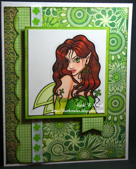
This week's challenge at The Outlawz Coloring Challenges is Green or St. Patrick's Day. My Outlawz Coloring Challenge Teammates, Carla, Penny, Laine, and I challenge you to use create a project for this challenge. You can use any color medium you like, just as long as you color! 

Our March sponsor at The Outlawz Coloring Challenges is Sweet Pea Stamps, who is offering our lucky winner four digis of his/her choice from the Sweet Pea Digi Stamp Store.  Play along with us for your chance to win! 


 Celtic Fairy was resized in PhotoElements, printed out onto Neenah cardstock using my laser printer, then colored with Copic markers. Palette chalk was used to add a bit of blush to her cheeks. Her earrings were touched with a bit of Clear Gelly Stardust Glitter pen to make 'em sparkly and several layers of Clear Gelly Glaze pen to add shine and dimension.

The patterned papers are from old Origins and Lime Rickey collections by Basic Grey. An older QuicKutz scallop border die was used, as was a Fishtail Flag die by Die-namics. Most paper layers were sponged with Peeled Paint and Forest Moss Distress inks. Some shamrock patterned ribbon was added to the mix for an additional touch of the Irish! The papers and ribbon were layered according to a sketch from The Deconstructed Sketch Challenge Blog

Here's the sketch, so you can see how I did with it!


Thanks for visiting today!

I shall enter this card into the following challenges.
The Deconstructed Sketch Challenge: #192
Creative Moments Challenges: Anything Goes/Green 
Simon Says Wednesday Challenges: Things that Fly
Dies R Us Challenges: Monochromatic 
Die Cuttin' Divas Challenges: St. Patrick's Day 


Wednesday, March 11, 2015

Oh My Stars!

Carol Fox is our hostess this week at Stampotique Designers Challenge Blog. Her challenge is "Stars".

This is what she had to say about her challenge.
"Feature stars this week, one or more on your arty creation. As part of your background or a main feature, it's up to you. Just have fun with the challenge."
If you'd like the chance to win your choice of $30 worth of Stampotique stamps, you should play along with this challenge. Visit Stampotique Designers Challenge blog and be sure to read the rules so that you'll have the chance to win that great prize!!!  


Peace and Love with Words on the Side (without the words) was stamped with Tuxedo Black Memento ink, colored with Copic markers, fussy cut, and edged with a black marker. Her wings and crown were touched with a bit of Clear Gelly Stardust Glitter pen. When the ink dried, several layers of Clear Gelly Glaze pen were added to the crown to make it dimensionally shiny as well as glittery. Peace and Love with Words on the Side was set aside while I created a starry background for her.

White Media Modeling Paste (DecoArt) was scraped through the Starry Nights stencil (The Memory Box) onto 140 lb. Mixed Media cardstock (Strathmore) and allowed to dry. When it was dry, a wash of Pthalo Blue and Dioxazine Purple Media Fluid Acrylic paints (DecoArt) were sponged over the stars. A baby wipe was used to wipe back the paint over the stars. The background was allowed to dry, then another wash, using the same colors was sponged and wiped back again. This was repeated until I was relatively pleased with the variegated look. 

A few of the stars were then brushed with Clear Wink of Stella Glitter pen (Zig/EK Success) to make 'em sparkly. 

Capture the Magic was stamped with Jet Black StazOn ink onto white glitter paper (DCWV) because I wanted to see if that would work. I was delighted to see that it did. The open letters of Capture the Magic were painted with both Pthalo Blue and Dioxazine Purple Media Fluid Acrylic paints. I did go over the script words "the Magic" with a black fine tip pen.

The glittery paper carrying with the sentiment was adhered to the dimensional painted background cardstock and the Queen of Peace and Love with Words on the Side was adhered in position to finish the card.

Thanks for visiting today!

I shall enter this card into the following challenges:
The Corrosive Challenge Blog: Follow Your Heart
CAS on Sunday: Girl Power
Simon Says Stamp Wednesday Challenges: Things that Fly

Tuesday, March 10, 2015

Lotus Trio!


I'm quite taken with SCACD's new Blank Lotus Pair from the new Eclectic Collection #2 and decided to do an experiment with them.

I stamped the Blank Lotus Large once and the Blank Lotus Small twice onto map-printed vellum using Jet Black StazOn ink. The vellum was flipped over and the lotuses were colored with pink, violet, and blue colored pencils (Polychromos). When I was done, all three were fussy-cut and set aside.

A flat canvas was layered with torn printed tissue paper (Idea-ology) that was adhered with Matte Multi-Medium (Ranger). When it was dry, Texture Sand Paste (DecoArt) was spread along the bottom of the canvas and two Buddha charms and a coin were pressed into it and allowed to dry.

Meanwhile white cardstock was die-cut with SCACD's Contempo Compass Statement Corner diePeace (Impression Obsession), love (Little B), Believe, Create, Hope, Dream, and Wish dies (Elizabeth Craft Design). These die-cuts were adhered to the canvas with Matte Multi-Medium. More Matte Multi-Medium was brushed over the canvas and allowed to dry.
  
Burnt Sienna Media Fluid Acrylic (MFA) paint (DecoArt) was dry brushed over the Texture Sand Paste and allowed to dry. Watered down Pthalo Green-Blue and Pthalo Blue MFA paints were brushed over the bottom part of the canvas, then watered down Cobalt Blue Hue and Cobalt Turquoise Hue MFA paints were stippled over them to deepen the color.

Titanium White and Cobalt Blue Hue MFA paints were mixed, watered down, then brushed across the top portion of the canvas. Streaks of watered down Titanium White were added.

When the MFA paints were very dry, several layers of Matte Multi-Medium were brushed over the entire canvas. While the MMM was wet, the three colored lotuses were adhered to the canvas, then more MMM was sponged over top. Whereas there was a bit of puckering, the vellum stayed down, though the colors of the flowers seemed to change a bit. The pink became redder, the blue became greener, and the violet darkened. 

The Texture Sand Paste was sanded back a bit to reveal some of the sandy colors and the metal charms were also sanded back to show more texture. 

The wings of three dragonfly charms were painted with Blue Green Light and Interference Green. A black Sharpie pen was used to color the dragonflies' bodies. The dragonflies were adhered to the canvas.

The last step was to add a bit of silvery rub stuff (whose name escapes me) to the raised corner and words.

Thanks for visiting today!

I shall enter this canvas into the following challenges:
• Craft Your Passion Challenges: Anything Goes 
Not Just Cards Challenges: Anything Goes 
Simon Says Stamp Monday Challenges: B is for (Buddhas, Blue) 
613 Avenue Create Challenges: Anything Goes/Aquamarine 
Scrapy Land Challenge #13: Anything Goes 

Friday, March 6, 2015

A Flower, a Ladybug, and a Dragon...

This week's challenge at The Outlawz Coloring Challenges is Flowers, in honor of Plant a Flower Day, which is March 12th. My Outlawz Coloring Challenge Teammates, Carla, Penny, Laine, and I challenge you to use create a project for this challenge. You can use any color medium you like, just as long as you color! 

Our March sponsor at The Outlawz Coloring Challenges is Sweet Pea Stamps, who is offering our lucky winner four digis of his/her choice from the Sweet Pea Digi Stamp Store.  Play along with us for your chance to win!

Here's my card for this week with Sweet Pea/Lisa Victoria's Dragon Luck.


Dragon Luck was resized in PhotoElements, printed out onto Neenah cardstock using my laser printer, then colored with Copic markers. The stamp panel was die-cut using one of the dies from Straight Rectangle Multi-Frames die set (Nellie Snellen).

The next largest die from this set was used to die-cut the semi-solid patterned paper from the Sweet Threads 6x6 pad (Basic Grey). A Scalloped Ribbon Border die (Die-namics) and one of the dies from the Conversation Bubble 2 set (Spellbinders) were used to die-cut the stripey paper from the Sweet Threads pad. The Hello die (Elizabeth Craft Designs) was placed in the center of the Conversation Bubble and run through my beloved oft-used Big Kick. Hello was also die-cut from semi-solid paper left over from the mat layer then inset into the Conversation Bubble. 

For some bizarre reason, I decided to run stitches through the holes in the Conversation Bubble. Since I'm needle-impaired, this step probably took longer than resizing the image, printing it out, coloring, and die-cutting all the elements of the card. Miraculously, no blood was shed in this process. 

All edges of the patterned paper were sponged with Gathered Twigs Distress ink, then sheer ladybug patterned ribbon was layered over the scalloped border die. 

Thanks for visiting today! 

I shall enter this card in the following challenges:
Creative Moments Challenges:  Anything Goes/Spring Greens
Scrapy Land Challenges: Anything Goes/Dies
Creative Card Crew Challenges: Green

Wednesday, March 4, 2015

Numbers!

Jackie Payne is our hostess this week at Stampotique Designers Challenge Blog. Her challenge is "Numbers".

This is what she had to say about her challenge.
Numbers have been around for a very long time! They feature so much in our lives! I would like you to incorporate a minimum of one number into your project! I hope you have fun!
If you'd like the chance to win your choice of $30 worth of Stampotique stamps, you should play along with this challenge. Visit Stampotique Designers Challenge blog and be sure to read the rules so that you'll have the chance to win that great prize!!! 

As you may or may not know, I've had the flu for more than a week now, so I will claim that the fevers and delirium of the flu made me create this ghastly punny card. The Toucan/Twocan pun had to be released from my feverish congested skull so I could move onto my more normal creations. So without further ado, here's it is.


I used a Post-It note to cover the Budgie prior to inking the stamp with Tuxedo Black Memento ink. The Post-It note was removed and Toucan was stamped onto Neenah cardstock, then onto Eclipse Tape. The Eclipse Tape impression was fussy-cut, placed over Toucan, and poor Budgie was covered up yet again. The second Toucan was stamped with the help of my trusty Stampa-ma-jig stamp positioner, then both Toucans were colored with Copic markers, using a Googled image as a guide. Did you know that there are many, many different variations on a Toucan's coloration? Now you do.

When I was done coloring the Toucans, their beaks, claws, and talons were coated with several layers of Clear Gelly Roll Glaze pen to make 'em shiny and dimensional. Their eyes were coated with Liquid Glass (DecoArt's Media line) to add glassy pop-eyed dimension and shine.

Copic markers were used to outline and then color one of the two branches on the Flowing Branches stencil (Designs By Ryn). which was positioned under the Toucans. The image panel was die-cut with a Nesting Rectangle die (Lifestyle Crafts), then matted with a black cardstock cut with a slightly larger die from the same set. This was set aside while I worked on the background.

I vaguely remembered that I had a piece of 12x12 black and white number-patterned paper in my stash and Eureeka! I was right! The paper is by 7 Gypsies and has a copyright of 2003 on it, which makes it older than most wine I drink. I used Tim's Wrinkle-free Distress Technique with Squeezed Lemonade, Spiced Marmalade, Dried Marigold, and a touch of Ripe Persimmon Distress inks to color the paper. 

Spiced Marmalade and Dried Marigold Distress inks were sponged over the Numbers mask (The Crafter's Workshop) to add another numbered element to the mix. 

The sentiment was computer generated with an outline font, which was then colored with a Copic marker. All edges were sponged with Black Soot Distress ink and the card was assembled. I actually think that this sentiment would be great for an engagement, anniversary, wedding, or friendship card!

Once again, sorry about that horrific pun. Thanks for visiting today!

I shall enter this card into the following challenges:
The Mixed Media Card Challenge: Hints of Spring/Optional Bird
Marker Pop Challenges: Anything Goes
Paper Take Weekly: Anything Goes